The FAA in the Palm of Your Hand Web Dev, Design, and UX
Challenge
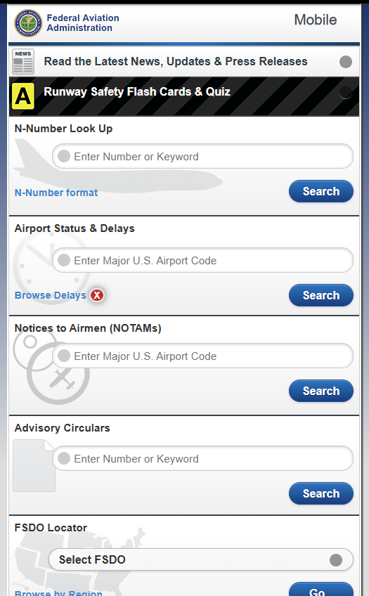
Create a mobile-friendly site that surfaces some of the top tasks of the traveling public, airmen, and hobbyists and provides quick access to utilities such as air traffic delays at airports, N-number registries, etc.
Rationale
The challenge for this project was converting the incredibly jargon-heavy data into user-friendly plain language. For example, when the problem at an airport is related to a thunderstorm, it would be flagged as WX: TSTMS which is fine for the air traffic controller in the tower but not so much for the general public sitting in the airport concourse. Additionally, this was at the beginning of the responsive, mobile-first era so we had to develop for a much broader range of support using jQuery Mobile.
Critique
Obviously, this type of mobile-only site was eventually usurped by the responsive, mobile-first approach, but for its time it was definitely unique.
Not really a critique, but the office I worked in at FAA had reporter notebooks which were long and thin and made great tools for keeping your mobile design sketches constrained. That experience served me well later when doing exercises like Crazy Eights brainstorming.