Car Wash Poster Graphic Design Coursework
Challenge
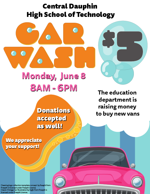
Revamp a black and white design for a “retro” themed car wash into a colorful and eye-catching poster using no more than two typefaces.
Rationale
The original design used a 1970s feeling font coupled with a Model-T style car to get a “retro” feel. The client wanted to keep the copy and the retro feel, but jettison pretty much everything else. My first thought when I thought of car washes was of those big poofy sponges with big holes in them and that inspired my choice of fonts. The round counters were ideal for turning into bubbles and from there using bubbles was a great way to set off the call-to-action.
Critique
Admittedly, the “$5” could have been rendered better as it is a bit hard to read at a distance which is a common case for a poster. However, the constraints of the project only allowed the use of two fonts and I felt the other font was too weak for the call-to-action. In a real scenario, I might have tweaked that individual character to make it more distinctly a five.